November 19th, 2015 by Adam Sandman
software development user interface
The SpiraTeam development group has been working really hard on version 5. It will bring many great new features that our users have been requesting. We also get asked about refinements to the user experience. We have been equally busy carefully updating every screen, every button, and every field our customers will see and use in version 5.
First Impressions
We all know that first impressions count. The first thing users normally see in any web application is the login screen. Even with lots of changes under the hood, a changed (and hopefully improved) login experience can be the difference between users feeling the difference and not.
The login screen for SpiraTeam 5 is where the design process for the whole application started. The design ideas there helped set the tone for how we would approach the rest of the application. We want to create something familiar but also cleaner, simpler, more streamlined, and mobile-friendly. From version 5, the entire application will be fully responsive.
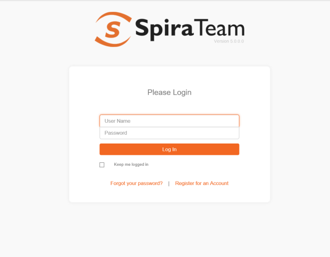
In our view, a login experience should make sure you:
- Know what you are logging in to
- Can easily log in with existing credentials
- Are given guidance about what to do if there is a problem
- See any important extra information (such as disclosures or update notices)
The login screen from previous versions of SpiraTeam has ably performed the first essential three. The ability for an admin to show messages to users on login has been long requested. It was hard to add this within the constraints of the existing design.
We’ve worked to strip away all parts of the design that were not essential, and make the elements that remained simple, clean, and usable on any device.
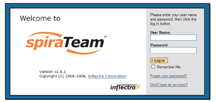
SpiraTeam has come a long way, in large part due to how we interact with the web vs. native applications and improved web standards. For versions 2 and 3, we sported a blue border. The login screen was designed to be reminiscent of corporate desktop applications as much as the web.
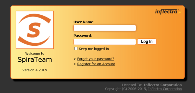
In version 4, we shifted to orange on a dark background. It gave the login screen a more universal feel across the web and operating systems and a strong link to our application color palette.
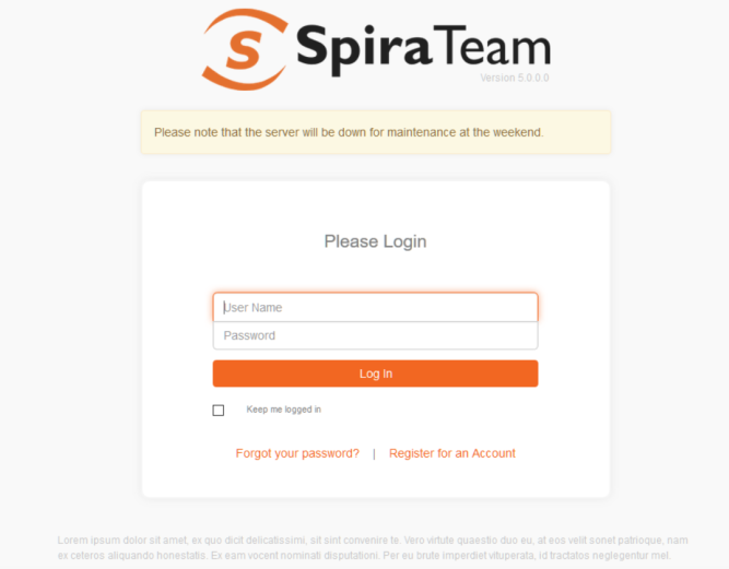
Version 5 looks much simpler and lighter. We have tried to strike a balance between learning from the best of modern web design while still letting our personality show through. The indicators to tell people this is SpiraTeam are clear. At the same time, the eye is easily drawn to the actions you can take.
The screen feels calm even with a company disclaimer and an alert from the administrator.
A Unified Design
This is the first version of SpiraTeam to be responsive. It’s an exciting challenge to make a business-focused application that can scale from smartphones to dual-monitor high-powered developer workstations. This goes well beyond just making everything have a responsive layout.
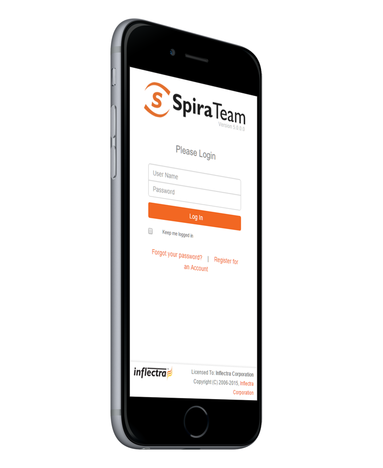
Our design could get even simpler for smartphones. With less white space, the login screen can be stripped back to a very simple one-page screen. We think it will be a great first step into a fully mobile experience in SpiraTeam, and we can’t wait to show you more of it.
Update:
Spirateam 7.8 is ready to be released in September 2023.
